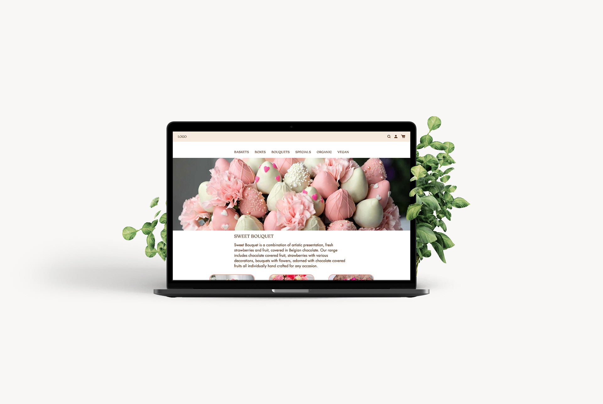
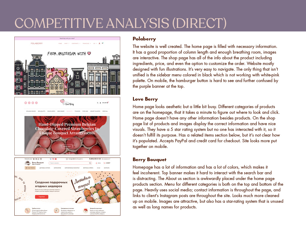
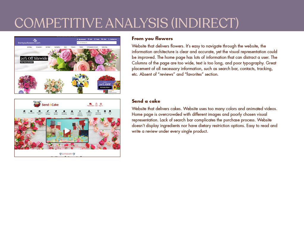
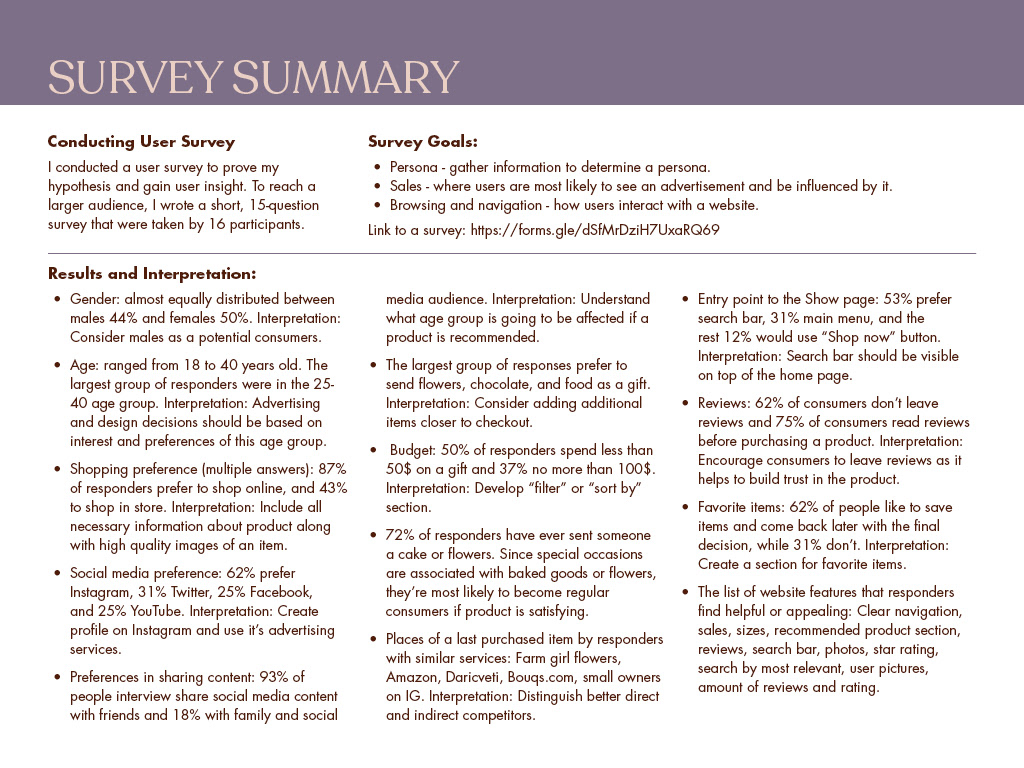
Sweet Bouquet
My role: UX/UI Designer
Design tools: Adobe XD, Illustrator, Photoshop, InDesign
About the project: Using mainly Adobe XD, I have created a high fidelity clickable prototype design for a local e-commerce website. This is a case study that include research of direct and indirect competitors, user survey, potential customers interview, data analysis, primary and secondary persona, IA, user flows, paper prototypes, digital wireframes, clickable prototype, testing, mood board, style tile, and a high fidelity clickable prototypes.
This project was part of my Google Internship/Mentorship. It was independently executed by me and overseen by the Senior Interaction Designer from Google.
Understanding the problem
On special occasions people like to delight their loved ones with beautiful yet edible gifts. It is difficult to find a website that will have both flowers and chocolate covered berries and fruits in one adorably packaged gift box. Many such services provide low quality items that are not acceptable for a truly special occasion. A flower bouquet also ends up in the trash, and doesn’t serve a purpose beyond a brief pretty item. It is also not very suitable for an event that has a pre-made flower arrangement, such as a wedding. People want a high quality and useful product that is appropriate for a special occasion. Additionally, edible flowers frequently lack any ability to customize the gift, unlike a flower bouquet (although this is a problem on many flower delivery sites as well). Finally, users are limited in their choices, not only in design, but also for a special vegan or gluten free options.
User Needs
After conducting research from clients that have used other brands, I discovered the top user needs and frustrations:
• Users must be able to customize the gift to suit their event with a range of fruit, styles, dietary restrictions, and designs.
• Users must have a consistent product available to them that is aesthetically pleasing and is delivered, undamaged.
• Users must have vegan/organic/dairy-free options that they can choose from.
• Users must be able to create specialized bouquets by using step-by-step Q/A sections to fulfill the desire in customized orders
User personas
Based on my research, I recognized that there were 2 key user types that our product tried to solve problems for. I decided to focus on both Persona since their needs were different.


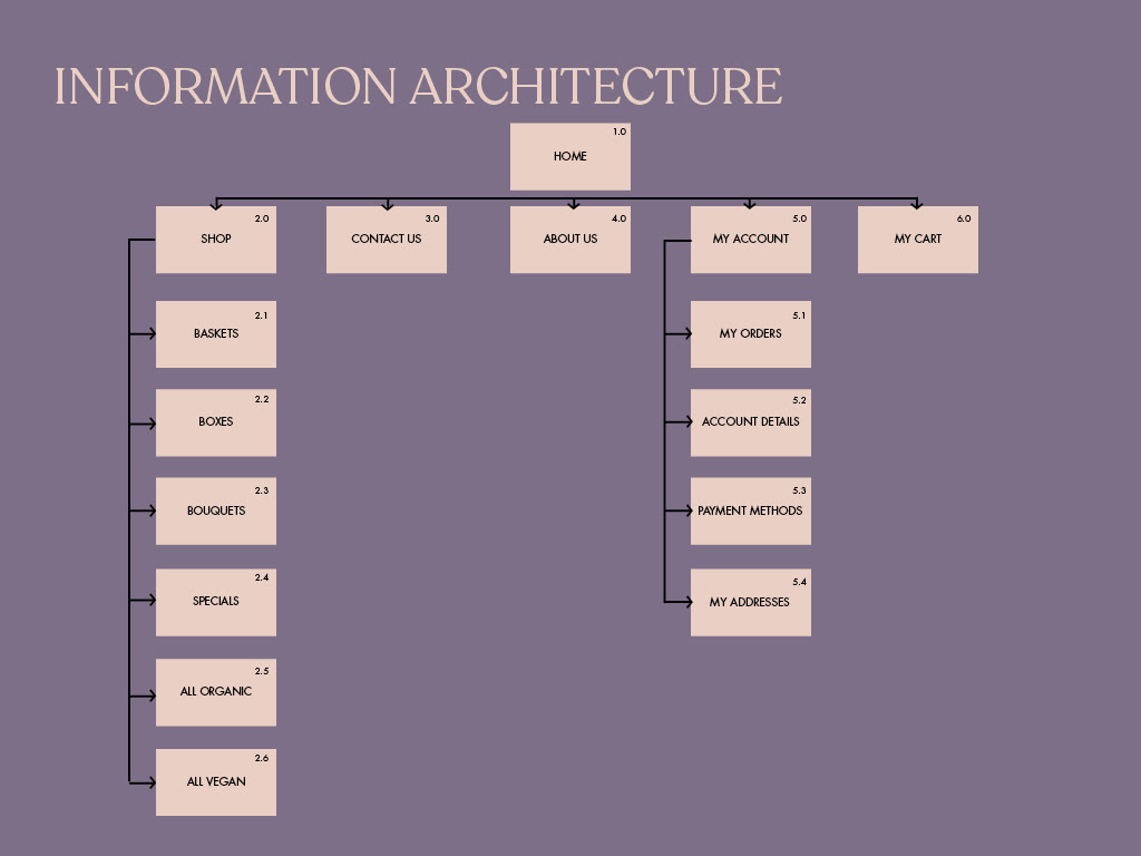
Information Architecture
Based on the insights gained from competitor analyzes, survey summary, and Card Sorts with potential users, I defined the sitemap and then evaluated it via two user flows.
User Flows
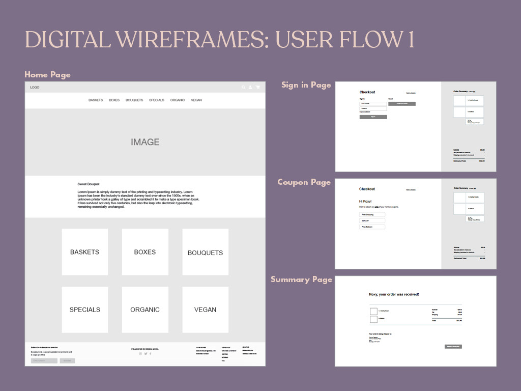
USER FLOW 1: the task for the first user flow was to redeem a coupon to receive a discount.
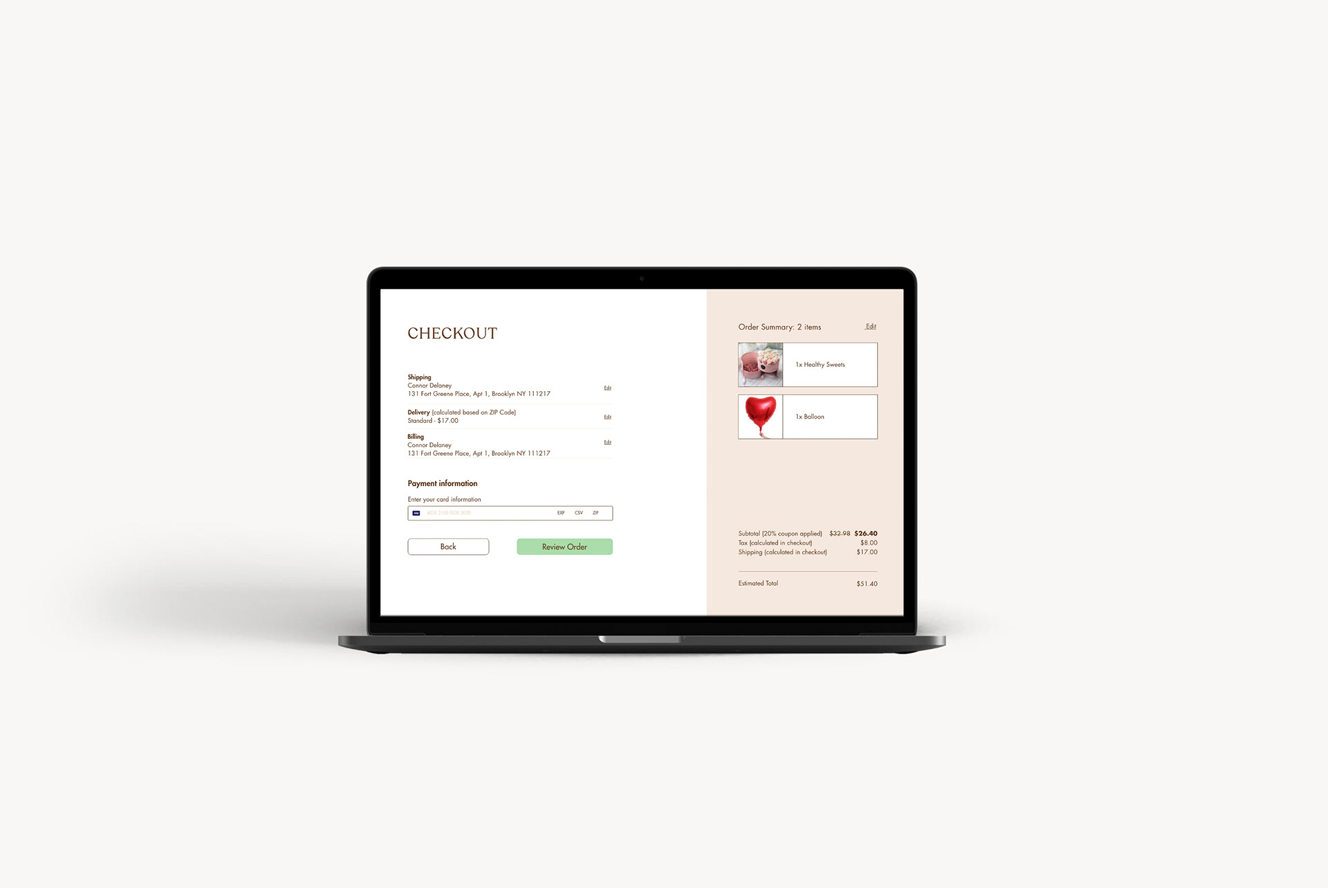
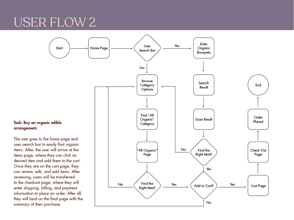
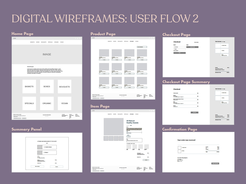
USER FLOW 2: the task for the second user flow was to buy an organic edible arrangement.

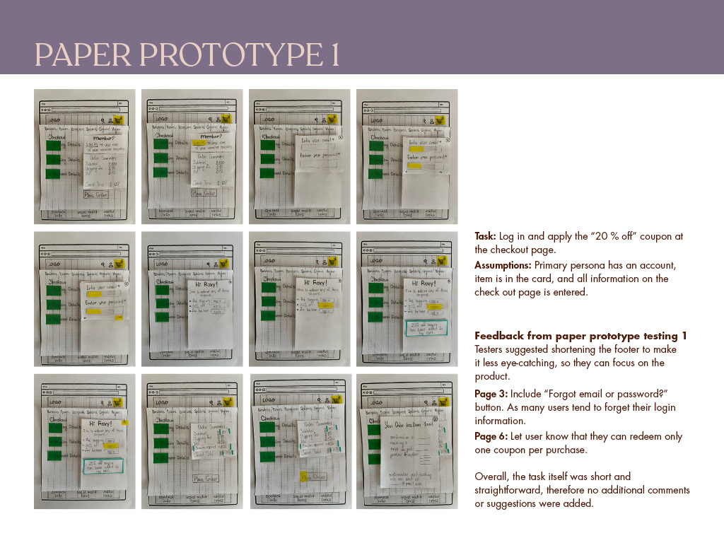
Paper-Prototypes & Testing
I created two low-fidelity paper prototypes for two user flows, the general structure of the application was tested in usability tests. Without much effort, adjustments could be made before going into the much more costly digital implementation.

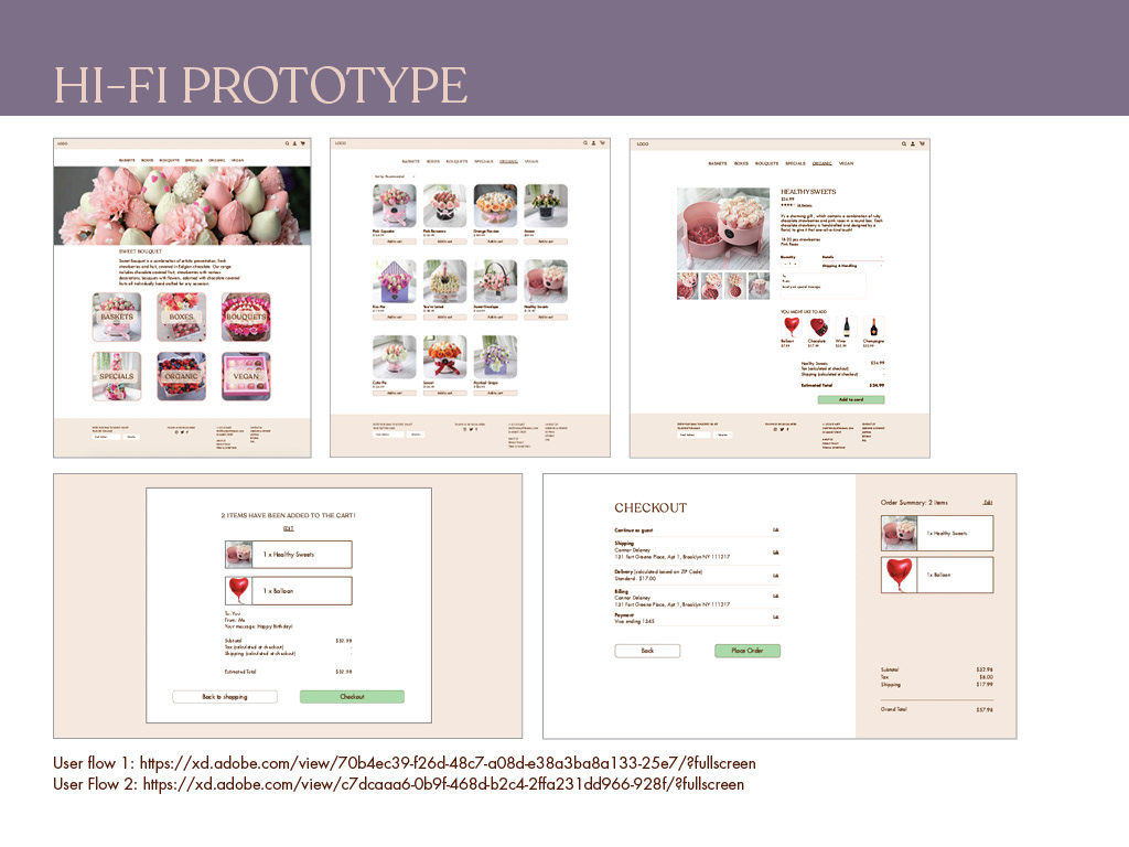
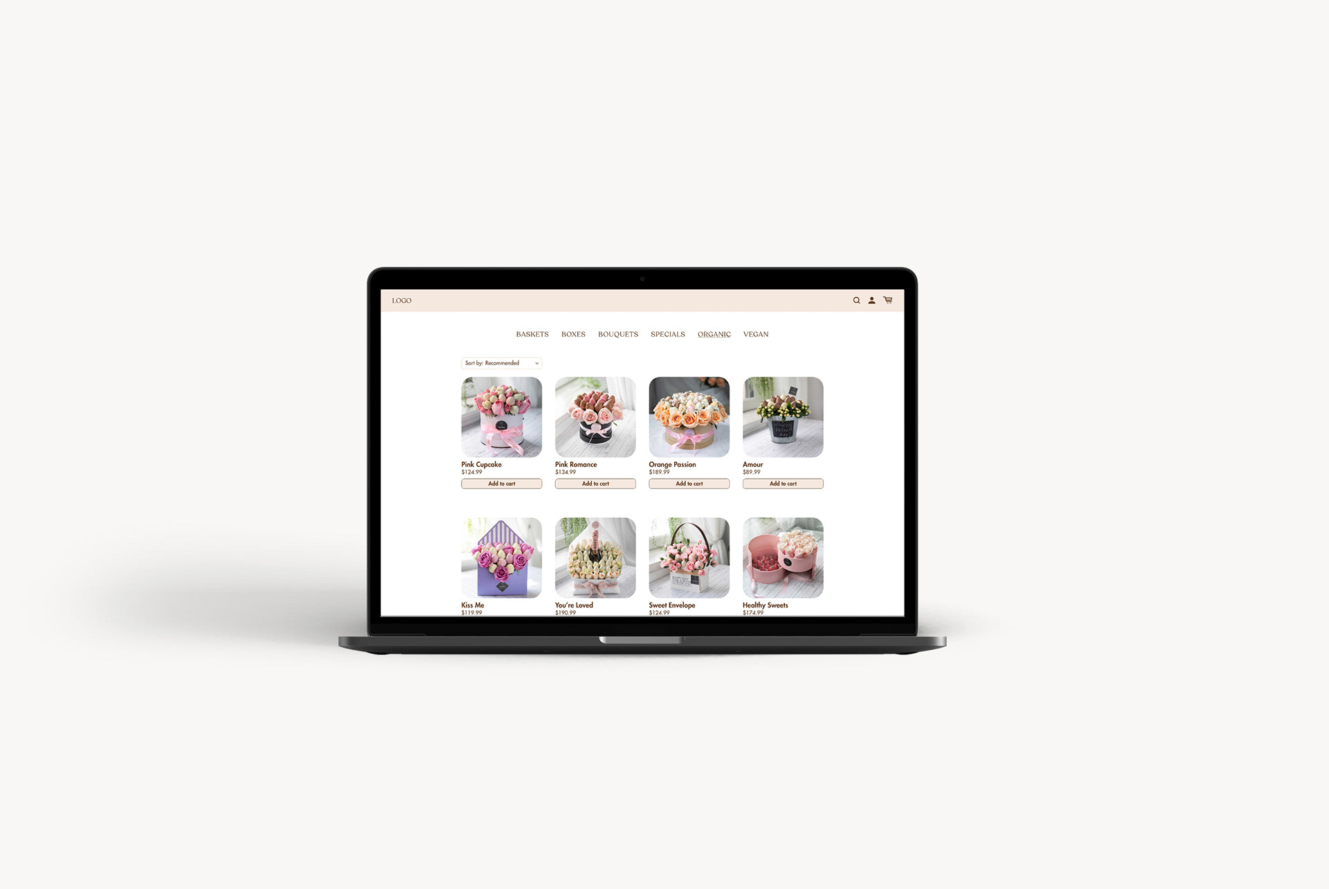
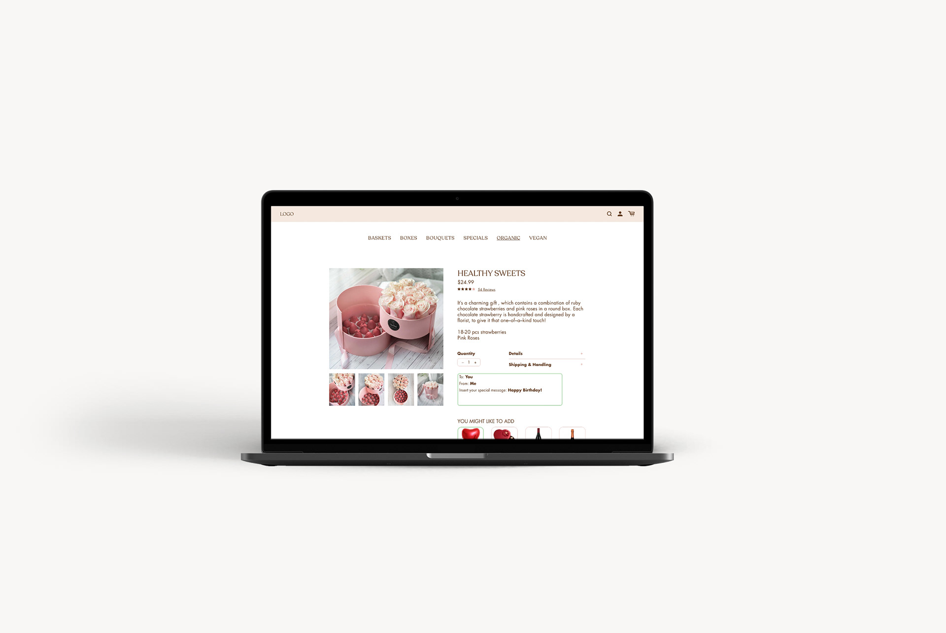
Clickable Prototypes & Testing
After some paper prototyping adjustments, wireframes, mid- and high-fidelity prototypes were created, which I supplemented with clickability using InVision. Again, user tests revealed small vulnerabilities in the structure of the user interface, in some formulations and interactions. In addition, the users asked smart questions, which led to further improvements.

Visual Design
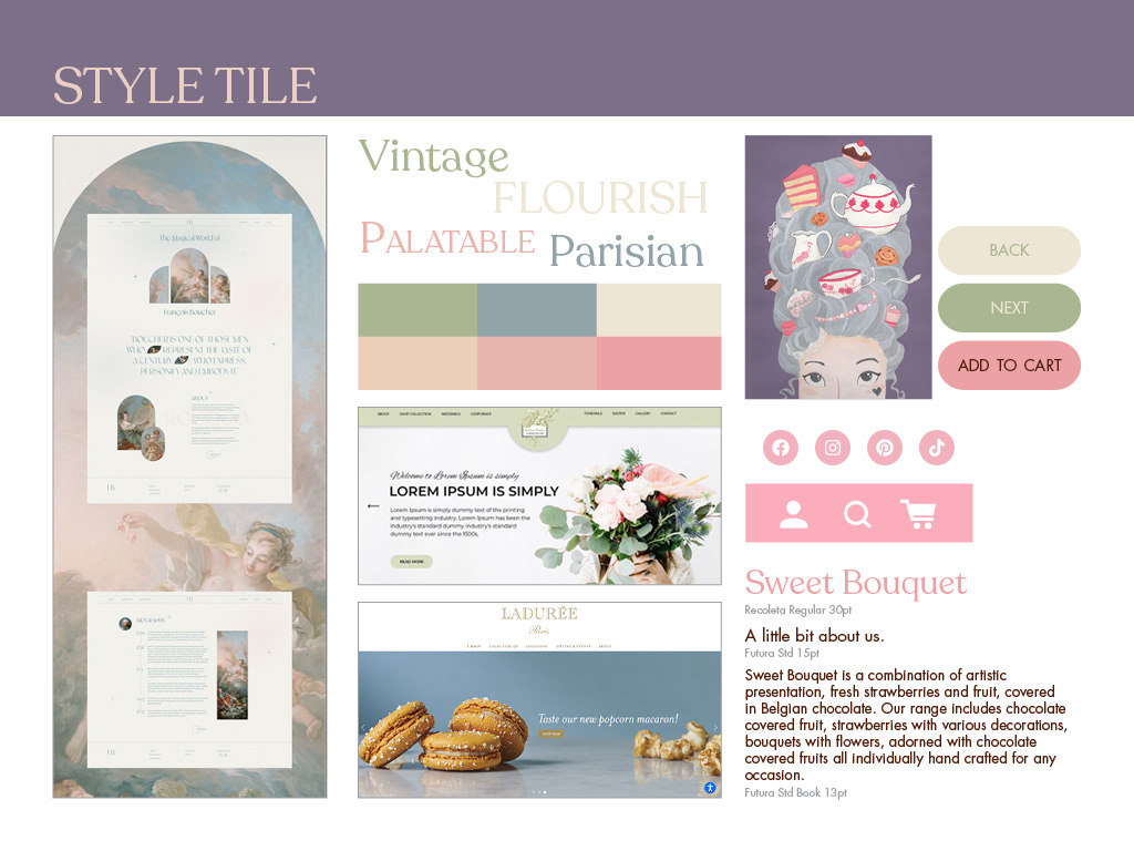
The visual design was developed by iterating from mood boards and style tiles to the UI kit and finally to creating a first version of the style guide.

Conclusion & Visual Examples
Challenges: The main challenge for this project was to understand user needs to create a user-focused website. It was also difficult to understand how users navigate on the website to come up with a usable information architecture. I didn’t want to create a website heavy on colors and text, therefore I had to apply a simple approach to a type heavy layout.
Solution: My solution to the challenges was to create a user friendly website that meets most of user expectations. Based on research and surveys, I filtered items on the website - including items users most likely to buy and remove unnecessary products. After continuous website testing with different users, I better understood the psychology of a user. It helped me to design an information architecture for smoother user flow. Also, I simplified the narrative content, so it doesn’t overwhelm the user but still communicates essential information.